View Poll Results: Which is the best?
- Voters
- 20. You may not vote on this poll
-
Jacob 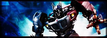
-
Knibbler 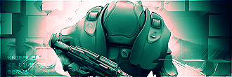
-
Kittycat72 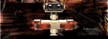
-
Samus-Fan 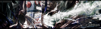
-
 SOTW 61 :: Vote For Your Favorite! SOTW 61 :: Vote For Your Favorite!
Hello everyone!
This is the poll for SOTW 61!
We have 4 wonderful entries, which you get to pick which one you think is the best.
Do NOT vote for yourself!
Have fun, good luck!
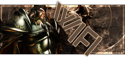
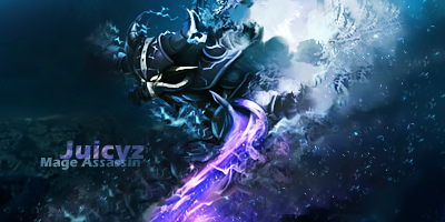
1. Jacob
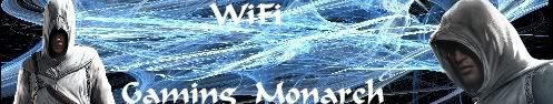
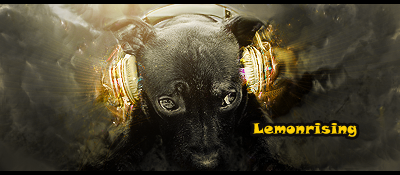
2. Knibbler
3. Kittycat72
4. Samus-Fan
Good luck everyone! Thanks for the great SOTW! Now enter SOTW 62!
-
Voted for Knibbler. Nice and simple. Cool color to.
-
knibbler.
Good luck guys <:
I didn't get to enter this one >:
 Juicyz gave me a puppy! <3
-
-
I'm like Jacob's... but I think Samus's is even better.
-
Voted for kitty. GL everyone
-
Hnm - don't be offended for my input, please... ( just adding some assistance and help where I can ).
Jacob: I like your work a lot, however I think your over exposure around Optimus is a little excessive. I like that your choice of colors all work together somewhat harmoniously, however I would have liked to see a little more purple - to pull the red more into the sig and less contrast.
I'm HUGE on text though and I think the feeling and representation of the image and it's text with your name in there just don't work. Granted, it's just your name - but by adding it into your sig, you've made it apart of the art itself.
And I'm a little creeped out by IronHide(?)'s phantom head on the left. Lol. <3
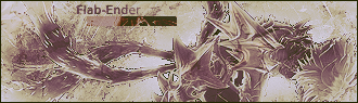
Knibbler: There isn't much that I should say or can say about this. Your work is impeccable. The colors are all in sync. I <3 5x5 font. And the tech style feeling is all there. I would have liked to see a little more color, but it still works.
Kitty: I love Rob! Good choice of character picking for your art, however you need to tie the piece in with your character selection. The ribbons and background - while they look good, they don't match anything in your piece. It should fit. It should flow. Rob is a machine, so think technical - think blocky - think clunky, like Rob. <3 Also - same with the text. I would have maybe tried System or a Digital Clock looking font. n_n!
I'm also big on borders. D:
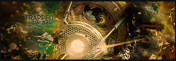
Samus: While I really dig your piece, I can't even tell what in the world is going on. Lol. I love the visual stimulation, but the piece isn't representative of anything. It's appealing, but it's chaotic also. <3
All of you did an amazing job and please don't take my critique to heart, but as something to help you grow in your already outstanding abilities. n_n!
-
 Originally Posted by Exodyus

Hnm - don't be offended for my input, please... ( just adding some assistance and help where I can ).
Jacob: I like your work a lot, however I think your over exposure around Optimus is a little excessive. I like that your choice of colors all work together somewhat harmoniously, however I would have liked to see a little more purple - to pull the red more into the sig and less contrast.
I'm HUGE on text though and I think the feeling and representation of the image and it's text with your name in there just don't work. Granted, it's just your name - but by adding it into your sig, you've made it apart of the art itself.
And I'm a little creeped out by IronHide(?)'s phantom head on the left. Lol. <3
Knibbler: There isn't much that I should say or can say about this. Your work is impeccable. The colors are all in sync. I <3 5x5 font. And the tech style feeling is all there. I would have liked to see a little more color, but it still works.
Kitty: I love Rob! Good choice of character picking for your art, however you need to tie the piece in with your character selection. The ribbons and background - while they look good, they don't match anything in your piece. It should fit. It should flow. Rob is a machine, so think technical - think blocky - think clunky, like Rob. <3 Also - same with the text. I would have maybe tried System or a Digital Clock looking font. n_n!
I'm also big on borders. D:
Samus: While I really dig your piece, I can't even tell what in the world is going on. Lol. I love the visual stimulation, but the piece isn't representative of anything. It's appealing, but it's chaotic also. <3
All of you did an amazing job and please don't take my critique to heart, but as something to help you grow in your already outstanding abilities. n_n!
Thanks for letting me know man!
also nice to see you put all that work a post.
-
Knibber Woot. Good Job All though.. Knibber <3 tech style + text, but maybe could use some extra colors like Exo said
 RWARZ
"I'm tired of "free style" themes,
RWARZ
"I'm tired of "free style" themes,
because then JuCi does some crazy abstract crap and everyone's wowed"
-
Thread Information
Users Browsing this Thread
There are currently 1 users browsing this thread. (0 members and 1 guests)
Similar Threads
-
By Samus-Fan in forum SOTW Archives
Replies: 5
Last Post: 12-12-2008, 04:40 PM
-
By LiNuX in forum SOTW Archives
Replies: 7
Last Post: 11-16-2008, 08:31 PM
-
By LiNuX in forum SOTW Archives
Replies: 9
Last Post: 11-10-2008, 04:04 PM
-
By Kiss in forum SOTW Archives
Replies: 13
Last Post: 03-04-2008, 05:47 PM
-
By Kiss in forum SOTW Archives
Replies: 13
Last Post: 02-26-2008, 05:38 PM
 Posting Permissions
- You may not post new threads
- You may not post replies
- You may not post attachments
- You may not edit your posts
-
Forum Rules
|
» Site Navigation

» Friends
» Sponsors
|


 Reply With Quote


 i likes the color