|
-
-

From the top, I like the second one.
Oh and the one u made for me! 
-
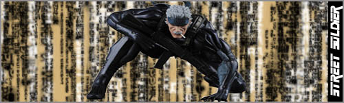
I actually like the black and white fire dude more for some reson... nice work tho
Losing Is Not An Option.
 Check out my Tumblr CarsndMore
-
 Originally Posted by HamadaLFC8

I actually like the black and white fire dude more for some reson... nice work tho
Yea, I just like the one with color cause it stands out.
that's the mascot for the band Disturbed
PSN = Street_Soldier69 [/B][/COLOR]
-
Pretty good job... but I do believe I like the black and white one better than the orange one. I do prefer dark colors though. 
-
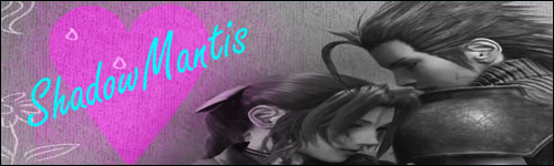
I hope you don't mind some C&C.
They're too empty, try adding some cd4s, brushes or clipping masks.
The size of them could add to the problem of the emptiness, try making them a little smaller.
You also need to blend your renders a bit more.
In Shadow's sig, the render of Aerith and Zack is a little squished.
Try some tutorials for a start, that's what I did. : )
They're a lot of fun sometimes.
But overall, I see some potential. : )
I hope my advice was helpful. ^_^
Keep posting!!!
-
i don't like that one because it's the mascot for disturbed lol. such an overrated band.
i have to say that the scarface one is the best, but they're all pretty basic.
-
Originally Posted by Yuuki
I hope you don't mind some C&C.
They're too empty, try adding some cd4s, brushes or clipping masks.
The size of them could add to the problem of the emptiness, try making them a little smaller.
You also need to blend your renders a bit more.
In Shadow's sig, the render of Aerith and Zack is a little squished.
Try some tutorials for a start, that's what I did. : )
They're a lot of fun sometimes.
But overall, I see some potential. : )
I hope my advice was helpful. ^_^
Keep posting!!!
Yes, I have tryed tutorials they don;t help me any, cause they are always about stuff I don't care about
PSN = Street_Soldier69 [/B][/COLOR]
-
Originally Posted by Street_Soldier69
Yes, I have tryed tutorials they don;t help me any, cause they are always about stuff I don't care about
What do you mean?
They're trying to explain how to make a sig.. lol
It's helping you.
If you enjoy making sigs, then it isn't about something you don't care about.
Unless you mean it isn't to your liking, then keep looking for another tut.
They're a gazillion out there.
-
btw what program do you guys use?
Losing Is Not An Option.
Check out my Tumblr CarsndMore
Thread Information
Users Browsing this Thread
There are currently 1 users browsing this thread. (0 members and 1 guests)
Similar Threads
-
By Joshuah in forum Graphics
Replies: 9
Last Post: 10-07-2010, 11:16 AM
-
By Sbamber in forum Graphics
Replies: 9
Last Post: 03-01-2009, 04:47 PM
-
By Samus-Fan in forum Graphics
Replies: 4
Last Post: 04-15-2008, 09:50 PM
-
By El3mentGamer in forum Graphics
Replies: 9
Last Post: 01-17-2008, 05:37 AM
-
By Riku-Nara in forum Graphics
Replies: 2
Last Post: 11-14-2007, 10:36 PM
 Posting Permissions
- You may not post new threads
- You may not post replies
- You may not post attachments
- You may not edit your posts
-
Forum Rules
|
» Site Navigation

» Friends
» Sponsors
|


 Reply With Quote