|
-
 Deadpool Deadpool
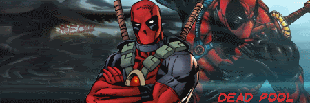
There it is, your thoughts?
-
pretty cool, what program did you make it with?
well first some comments are that it was nicely made but dont see too much affects around it just images, i see some but just two images, the words dead pool are great, sig names shouldnt be very big all the time, unless you can make it work
good job  keep it up keep it up
-
I use Paint.Net, I am still learning how to make effects, but thanks for the comments.
-
i've never used paint.net but its great for that so far the only good gfx i've made was with photoshop, ones i've made with paint is disgusting, ones with paintshop is ugly, and ones with gimp, well i didnt get far enough to finish one with gimp lol
just keep practicing u'll get better trust me
-
I like it, and agree with LiNuX on some of the things he pointed out.
Well done and keep at it!
-
Good stuff.
I agree with the other above as well.
I also prefer Sigs being smaller in height, but therefore larger in width! Keep it up though!
-
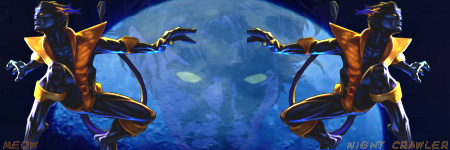
I made two others on the line of Marvel.

Pretty much the same.
and Night crawler:
-
i like the first one but still just two images, u need to use some filters, just test with those and see what it becomes
the second one just looks like one image over another reflected, just really empty, u should put some text on it before others take and use it for themself lol
-
I like the first one better. Good job, but Linux is right. Too empty...
-
Thread Information
Users Browsing this Thread
There are currently 1 users browsing this thread. (0 members and 1 guests)
 Posting Permissions
- You may not post new threads
- You may not post replies
- You may not post attachments
- You may not edit your posts
-
Forum Rules
|
» Site Navigation

» Friends
» Recent Threads
» Sponsors
|


 Reply With Quote