|
-

Be harsh. As always.
glad I found this, a good thread.
-
I like but i think that its missing something but i don't know what.
-
@ psychotray
RE: Bioshock.jpg
I think the border takes away from the rest of the signature too much. Its very bright and is the first thing I noticed when I looked at the sig. I think maybe darkening bigdaddy might help him 'creep' into the background more too.
@bitterkingskyler
RE: SasukeUchiha.jpg
The 'bitterkingskyler' text seems to be a bit harsh/choppy. I think a better font would suit it better. The render on the left is good but I'm wondering if he should be more center/forward. I know the right render is his brother, and it seems like you were trying to make him a 'commanding presence', yeh? So I don't think the brother's hand should overlap sasuke.
RE: GaaraoftheSand.jpg
Pretty much all I have to say on this one is that the text 'of' and 'the' are getting washed out a bit, and it'd be a good idea to add some colour behind them to make them pop some more.
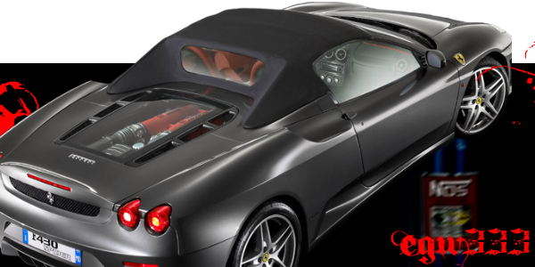
@egw333
RE: CallofDuty.jpg
The text kind of blends into the background with their similar colours and the lack of texture. Try using different lighting techniques and a different or brighter colour than the one you're using.
The background seems very flat and could use some contrast and texture. Going from a very high contrast render to a flat colour background seems lacking. Free Textures from TextureKing this site has some great textures for free that you can play with : D
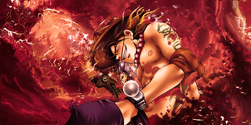
RE: Infamous.jpg
The render seems a little squished, fixing that would help a lot.
The text should maybe be a different colour than the lightning in the background, or vice versa. The 'o' looks a little lost there, and you can always paint over it a little bit to thicken it up to match the rest of the letters.
I would say lose the guy in the background altogether, or bring him in front of the lightning and make him more apart of the signature.
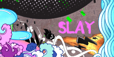
@Slay
RE: Slay.jpg
I think some of the elements in the background have choppy edges, and one of the black bolts seems to be missing a spot where it should be coloured in. The long white 'strings' should have all black/gray outline removed.
The text seems to be lacking as well, maybe some texture needs to be added to it? Can't really put my finger on it haha.
--------------------------------------------------------------------------
I usually try and add "I LIKE THIS AND THIS" to each critique but there's so many XD
I do like em all though, and keep up the fantastic work guys! Hope I helped D:
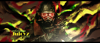
 Juicyz gave me a puppy! <3
-
 Originally Posted by LemonRising

@Slay
RE: Slay.jpg
I think some of the elements in the background have choppy edges, and one of the black bolts seems to be missing a spot where it should be coloured in. The long white 'strings' should have all black/gray outline removed.
The text seems to be lacking as well, maybe some texture needs to be added to it? Can't really put my finger on it haha.
I was aiming for that. I rendered it all myself, sorry for the choppiness.
I was going to make the Background lined paper, I couldn't find a good piece, so I went with brown. 
-
cnc pleaseee, i dont know what to think of my new smudging style, its not yet complete, cant get it the way i want it to look,but its almost there, so CnC
 RWARZ
"I'm tired of "free style" themes,
RWARZ
"I'm tired of "free style" themes,
because then JuCi does some crazy abstract crap and everyone's wowed"
-
wow i like it heres my new one
be harsh but keep in mind i havent done gfx in a few months
-
loooks nicee man! I'm not a pro at all but SOMETHING is off about it .. i don't know what ... but something's missing to make it perfect :P but that's just me ahah
Losing Is Not An Option.
 Check out my Tumblr CarsndMore
-
yo thats what i said when i thought i was done i know i just cant find out what :s
-
Alright I'll be harsh. If you're looking for a simple signature it's fine.
There is no WOW factor about it. Nothing pulls me in and nothing really catches my interest. Nothing catches my eye either. It's just sort of there. Theres no flow and theres no real...meh. And the random red splotches...Idk.
I don't know what you've been using for a program but it's just, every signature you do, it's been the same. You need to toy around with more tools and more techniques. Pasting renders into a canvas and adding text isn't...really doing graphics. I mean you can argue it down to the core but...bleh. You want something that you can say is YOUR specific style...
If you like just finding a render and pasting it in and putting text, then keep doing it. Art should make you happy. But when showcasing it for other people...if you put that up as a showcase of your abilities, I wouldn't be impressed.
I'm sorry if any of this offended you at all, I'm just speaking how I feel.
You have the want to do graphics. You have the desire. Experiment.
-
Thread Information
Users Browsing this Thread
There are currently 1 users browsing this thread. (0 members and 1 guests)
Similar Threads
-
By jakncoke in forum GF Lounge
Replies: 10
Last Post: 12-21-2008, 01:51 PM
-
By Samus-Fan in forum Graphics
Replies: 4
Last Post: 06-22-2008, 02:46 PM
-
By KiNg_.-.OF.-._ChAoS in forum Graphics
Replies: 2
Last Post: 10-31-2007, 10:41 AM
-
By Kiss in forum Graphics
Replies: 7
Last Post: 10-29-2007, 06:09 PM
-
Replies: 4
Last Post: 10-25-2007, 03:33 PM
 Posting Permissions
- You may not post new threads
- You may not post replies
- You may not post attachments
- You may not edit your posts
-
Forum Rules
|
» Site Navigation

» Friends
» Sponsors
|


 Reply With Quote