|
-

 Originally Posted by Th3-devils-princess

here are two new ones guys and girls 

The focal needs to be blended in more with the background, maybe add a few effects in front of your focal as well and the majority of the signature feels empty. But i love the way you implemented the text in the sig.
Originally Posted by Th3-devils-princess
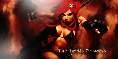
let me know what you think
The focal is blended in better with this one.
Though again it feels a little bit empty, the lightsource also feels out of place. (I can't see why there should be 2 lightsources :S)
The text also needs working on as I feel it destroys any of the flow in the tag and it just stands out too much.
Overall though, they are two very nice ideas and can be saved with a few more effects and adjustments. They just don't look finished.
If you send me FR, let me know who you are!

Thread Information
Users Browsing this Thread
There are currently 1 users browsing this thread. (0 members and 1 guests)
Similar Threads
-
By JeedOff in forum Graphics
Replies: 16
Last Post: 09-19-2009, 07:05 PM
-
By Jaykub in forum Graphics
Replies: 10
Last Post: 01-23-2008, 03:19 PM
-
By Kiss in forum Graphics
Replies: 4
Last Post: 10-29-2007, 11:54 AM
-
Replies: 22
Last Post: 10-17-2007, 07:14 AM
-
By Gamoc in forum Graphics
Replies: 6
Last Post: 07-14-2007, 07:19 PM
 Posting Permissions
- You may not post new threads
- You may not post replies
- You may not post attachments
- You may not edit your posts
-
Forum Rules
|
» Site Navigation

» Friends
» Recent Threads
» Sponsors
|


 Reply With Quote