|
-
 My Past Few Works My Past Few Works
I haven't made a lot of sigs lately but below are the ones I've made and some opinions and ratings would be nice. My batman sig was the longest sig (in time it took to finish) because of the batman logo render (did it myself) but the overall sig took about 15 mins
The other two took from 5-10 mins each.
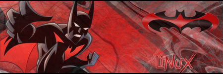
This one took me less than 5 mins because I made it to fill a spot in the SOTW lol. Also my first sig in months - batman was my last one in april i think.

just made this one, i messed up a bit on the text but didn't feel like fixing it, another space filler.

-
The Batman one is the best... the others look too easy. But they're still good. I'd rate them
7.7/10
5.8/10
6/10
Not sure though...
Last edited by KittyCat72; 07-13-2008 at 03:04 PM.
-
 Originally Posted by KittyCat72

The Batman one is the best... the others looks too easy. But they're still good. I'd rate them
7.7/10
5.8/10
6/10
Not sure though...
lol thanks - they are all easy and takes a few mins, i haven't learned any new tricks in the past 2 years I've been in PS mainly cuz i had over a year break in between and I know my artistic skills suck so i never bothered 
thanks for ratings!
-
1. 9/10
2. 8/10
3. 6.9/10
-
Originally Posted by :Master:
1. 9/10
2. 8/10
3. 6.9/10
geez, thanks...helps a lot with just numbers, was expecting some words in the posts as well
-
Well when I rate signatures for SOTW and stuff I go by how well everything blends. Some people go by whos in the sig, which I think is dumb and missing the point. Some people also go with how many visual effects are in it, which is alright I guess.
I give your bat man sig, a 8/0. All the colors go well togoether. You stuck with red and blue which is the bat man theme ( for the bat man atleast. ) For your
bender one, I feel like theres to much empty space. Everything goes togother well, but there should be somthing else in it. 7/10
Your Pokemon one lacks the same thing. Theres a big empty space in the middle of it. Also, I don't understand the glow effect on the right side of the screen. I think that it should be near the pokemon. The pokemon is made of fire and it should have somthing showing that. 5/10
There pretty good for the amount of time you spent on them.
-
Originally Posted by Trunks
Well when I rate signatures for SOTW and stuff I go by how well everything blends. Some people go by whos in the sig, which I think is dumb and missing the point. Some people also go with how many visual effects are in it, which is alright I guess.
I give your bat man sig, a 8/0. All the colors go well togoether. You stuck with red and blue which is the bat man theme ( for the bat man atleast. ) For your
bender one, I feel like theres to much empty space. Everything goes togother well, but there should be somthing else in it. 7/10
Your Pokemon one lacks the same thing. Theres a big empty space in the middle of it. Also, I don't understand the glow effect on the right side of the screen. I think that it should be near the pokemon. The pokemon is made of fire and it should have somthing showing that. 5/10
There pretty good for the amount of time you spent on them.
lol thank you, i like comments like this rather than just "9/10" 
bender one was a space filler again, well...not the sig space, the sotw space lol, i did simple brush strokes on the left to fill the emptiness, guess it wasn't great but oh well
and about the pokemon one - the background IS moltres, just super enlarged and liquified a bit. and the yellow stuff on the right side is moltres's flames. i tried, putting it right in front of him, doesn't look very good, well not to me at least lol
thanks for comments  appreciate it appreciate it
-
You make sig background very well.
They're fluid and match the render pretty well :]
1. 7/10. It's the best on up there. All I would say is to put a bit more contrast in the background.
2. 5/10. Everything matches, but there is a lot of empty space.
3. 6/10. I love the fading background, it's smooth and matches moltres well. It's still pretty empty though.
-
Originally Posted by rukisuto
You make sig background very well.
They're fluid and match the render pretty well :]
1. 7/10. It's the best on up there. All I would say is to put a bit more contrast in the background.
2. 5/10. Everything matches, but there is a lot of empty space.
3. 6/10. I love the fading background, it's smooth and matches moltres well. It's still pretty empty though.
good backgrounds huh...lol, maybe renders aren't my thing then.
maybe i should make a bunch of backgrounds and distribute them
thanks for comments - i figured everyone would think the batman was the best one - it was my first sig of the year lol, and these were the only 3 i've made this whole year
-
Originally Posted by LiNuX
good backgrounds huh...lol, maybe renders aren't my thing then.
maybe i should make a bunch of backgrounds and distribute them
thanks for comments - i figured everyone would think the batman was the best one - it was my first sig of the year lol, and these were the only 3 i've made this whole year
I would say add some brushes or c4ds along with the render.
Spruce it up a bit :]
Thread Information
Users Browsing this Thread
There are currently 1 users browsing this thread. (0 members and 1 guests)
Similar Threads
-
By jakncoke in forum General Gaming
Replies: 5
Last Post: 07-15-2008, 09:47 PM
-
By GF Eric in forum Graphics
Replies: 2
Last Post: 02-20-2008, 07:34 PM
-
By worldisyours11 in forum General Gaming
Replies: 2
Last Post: 11-02-2007, 09:16 AM
-
By Aaron. in forum Graphics
Replies: 42
Last Post: 08-20-2007, 08:32 AM
-
By Drake14 in forum Graphics
Replies: 12
Last Post: 01-13-2007, 04:32 PM
Tags for this Thread
 Posting Permissions
- You may not post new threads
- You may not post replies
- You may not post attachments
- You may not edit your posts
-
Forum Rules
|
» Site Navigation

» Friends
» Sponsors
|


 Reply With Quote