|
-

 Originally Posted by egw333

Hmmm.....I guess just 2 major things.
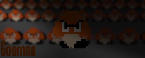
One, you used the Goomba as your focal, and the shading almost makes it look like you're hiding it. Usually (Depending on the mood of the tag) you want to make the focal stand out, draw attention to it, make it some eye candy. And then this would lead to two....
Two, The font isn't bad, but the text could use a little elbow grease. You have it in the corner (Not a bad thing) but it stands out, it kinda draws attention away from your focal, where as you want it to pull your eyes towards the focal, or have it match the flow of the signature. Personally, I suck at text. I find it very hard to make text for a signature, which is why I usually try to hide my text, it doesn't take anything away from a signature if it isn't there (usually)
And don't worry about making a signature yours, everyone starts at a point, and as they create more and more signature, a style develops, and that style is what makes it yours, not what you put into the signature.
Heck, that's why we can't do anonymous signature of the weeks. Every member here has a distinct style. Look at the nintendo one and you'll know what I mean.
I always like some C&C. Goes as hard as you can, it only helps.

Last edited by Samus-Fan; 08-15-2011 at 05:31 PM.
Thread Information
Users Browsing this Thread
There are currently 1 users browsing this thread. (0 members and 1 guests)
Similar Threads
-
By jakncoke in forum GF Lounge
Replies: 10
Last Post: 12-21-2008, 02:51 PM
-
By Samus-Fan in forum Graphics
Replies: 4
Last Post: 06-22-2008, 03:46 PM
-
By KiNg_.-.OF.-._ChAoS in forum Graphics
Replies: 2
Last Post: 10-31-2007, 11:41 AM
-
By Kiss in forum Graphics
Replies: 7
Last Post: 10-29-2007, 07:09 PM
-
Replies: 4
Last Post: 10-25-2007, 04:33 PM
 Posting Permissions
- You may not post new threads
- You may not post replies
- You may not post attachments
- You may not edit your posts
-
Forum Rules
|
» Site Navigation

» Friends
» Recent Threads
» Sponsors
|


 Reply With Quote